Hannah Effinger is the Production Editor of The Montclarion. She is responsible for most of the inner workings of our paper, including the process of printing and distribution. From putting our newsletter together to writing witty niche entertainment articles, Effinger is the jack of all trades for The Montclarion. To add to her mountain of responsibilities, Effinger took it upon herself to redesign our logo. To introduce the new look, Effinger has provided us with a little background into her process and why we as The Montclarion decided to make this change.
About six months ago, I asked our Editor-in-Chief, Emma Caughlan, if redoing the logo was something feasible, to which she responded, “Do whatever, but don’t make it look like the Monster energy logo.”
This might have been her worst decision yet, other than letting me write horoscopes again (check them out on page 10), or letting Avery and I do stand up at the banquet last year.
I did, in fact, make about five drafts that did look like they could be on a special edition Monster can, but after a few rounds of iterations, I figured it out.
As soon as I showed Professor George the new design for the logo, she said, “So, you’re trying to do the exact opposite of what the last rebrand hoped to accomplish,” and of course, I said, “yes.” The previous rebranding had served the purpose to emphasize the fact that The Montclarion is not only a newspaper but a multimedia platform; which it did. And like it or not I think the pandemic expedited this process, as the paper was forced to transition to a fully online publication from Spring 2020 to Fall 2021.
Now, everyone knows that The Montclarion is multi-platform, everything is nowadays, but what sets us apart is the physicality of our print paper.
Before the paper took up every waking moment of my Wednesdays – and often most other days of the week – I hardly ever picked up the paper. I’d check The Montclarion’s Instagram every now and then, read an article one of my friends wrote through the website, or even see one of Avery’s Montclair State University-themed memes on Twitter.
When I was a freshman, bright eyed and unscathed by a pandemic, seeing an (absolutely horrid) illustration I did for the paper printed in copies all around campus was the highlight of my year (that year was really lame).
Anyone can write articles and post them online, The Onion does it, Emily Ratajkowski does it, but it takes a lot of dedicated people to take all these articles and put them all together into a full print paper each week – where we come together as an editorial team, eat pizza, play MarioKart and watch the editors slowly lose our marbles each week.
In an attempt to be modern, The Montclarion’s previous logo falls short in the way that it seeks to cater to digital without acknowledging the inherent physicality of the format it is mainly presented on, the paper.
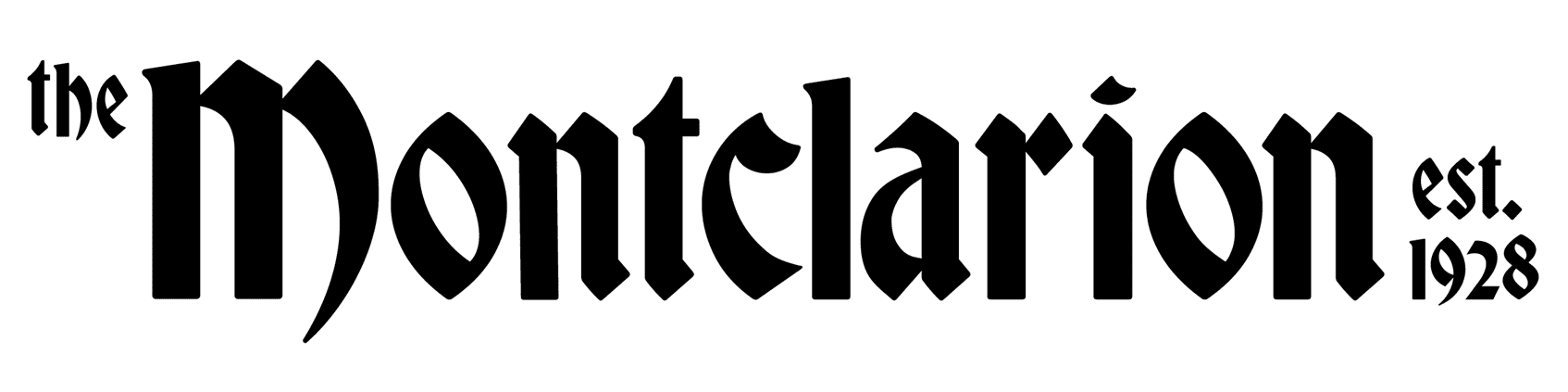
I won’t bore you all with the details of the history of a typeface, but in modern culture, blackletter typefaces are most often seen in newspapers and within academia. They have this subconscious influence where they radiate the feeling of credibility, of something formal and old that’s been around for longer than you or your parents could remember.
Thus, the return of the logo to something more print influenced – a modified blackletter typeface reminiscent of The New York Times or the Washington Post made sense in the context of the idea I was seeking to communicate.
However, (I will bore you all now) the basic style of typeface is one thing, but the smaller more invisible things like width, kerning and the rhythm within the logo are the things that really set it apart from its predecessor.
The elimination of the red color within the logo allows for more of a deviation from the standard Montclair State-based branding, emphasizing that we, The Montclarion, are not a university sponsored organization. We are for the students, by the students; and our branding should reflect that.
Within the first letter of the full lettermark, M, and the logo used on our social platforms, there is a claw-like motif within the last leg of the letterform. This plays on the idea of the Red Hawk as the overarching mascot of Montclair State, but is also drastically visually different from the branding the university uses throughout its marketing – linking us in an more indirect way.
![]()
So yes, this front page may not be what you’re used to seeing every Thursday in print, or when you check our socials to see what instagram reel the eboard made this week. However, it looks like you’re going to have to get used to it. We promise you that this makeover is only the next step in our continuous strive to (look really cool &) bring you excellent journalism while sharing the provocative and lively stories that fill our campus.
Hope you love it as much as I do (or just a little less because that would be weird.)
P.S. Huge shoutout to the lovely Emma Caughlan for letting me do this and being super supportive, and to Professor Anthony Inciong for answering my constant messages for critiques and giving me encouragement throughout this redesign process. You both rock and I am eternally grateful.