Chanila German | The Montclarion
This past weekend, Montclair State University remodeled its homepage, giving it a fresher and more modern look. No longer is it just a plain red and white page with outdated features. Now, it contains multiple aspects that make it more appealing.
Visitors can now scroll down on the page to get more information about Montclair State like statistic numbers, the campus’s distance from New York City, and the university’s acreage.
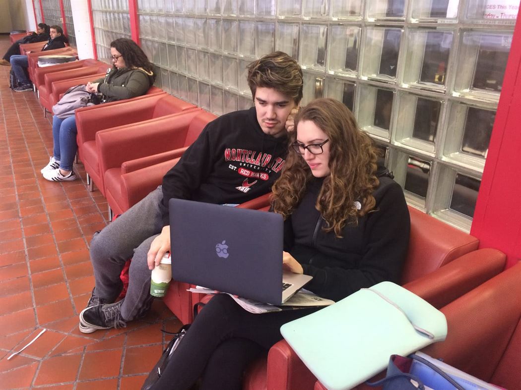
“We are looking at the home page right here, and they have definitely [made it more modern],” stated Brittany Tamburro, a linguistics major at Montclair State, while sitting and looking at the home screen on a laptop. “They got these big statistics [numbers] here, [the] acres of the campus because people want to know how big our campus is, average class size and the distance from New York…even though the trains don’t always run on time.”
“It is visually appealing,” Joe Woyce, a Spanish major and friend of Tamburro, said to her, as he sat beside her looking at the screen.
“You’re right,” Tamburro responded. “And I do like it much better. It’s more marketable. It was ancient—what they had beforehand.”
The homepage provides a small section showing updates from Montclair State, allowing visitors to click on it to read more about it. Many of the updates provided basic school information and upcoming coming events, while other parts talk about serious topics such as Middle States accreditation and immigration updates that help keep students and faculty in the loop.
On the right side of the page, different tabs provide visitors with easy access to search the Montclair State website. The four tabs include a menu that, once clicked, provides the option of looking through the admissions, academics, giving, campus life and arts and culture of Montclair State. After clicking one of these options, the visitor will be redirected to a specific page that allows them to find what they are searching for quicker.
Many students received an email about the updated homepage, and were promptly informed about the new changes. A few other students explained that they hadn’t received an email, and were a bit shocked when they opened up the page over the weekend.
“I didn’t know about it so I was confused when I went on the page. Especially when I am so bad with technology,” explained Nooron Eewshah, a communication and media arts major. “I really didn’t know what to do, but I got the hang of it [or] at least I think. I’m just going to have to go on it a bit more, until I get the full hang of it.”
While Eewshah thinks the page looks more appealing than before, she is not a fan of the new update.
“I’m the type of person that believes that if something isn’t [broken] just keep it that way so you don’t have to confuse everyone else,” she said. “So I prefer the other way because I am used to it.”