After years of the same, customary logos that have been plastered around the campus of Montclair State University, the athletic department made an unexpected change.
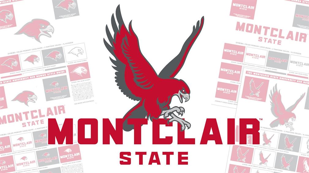
On March 24, the department announced a new branding initiative which includes brand new primary and secondary logos, as well as the introduction of new font types that will complement them.
The new primary Red Hawk logo comes with a darker shade of red and gray to go along with a font type that has a similar red shade. The secondary logo features the head of the Red Hawk with the same colors and font type.
These logos are expected to be used at least across the 18 NCAA Division III teams that the university offers, and it is more than likely that other campus departments will use these new logos as well.
Since taking over as the full time athletic director last fall, Robert Chesney has made it clear that he has plans to turn Montclair State into one of the premier Division III programs in the nation. It seems like adding new logos is a huge step in the right direction.
If you miss the old logos, do not expect to see them very often. The department has instructed all athletic teams to only use the new logos from now on when it comes to promoting the school in any way.
However, it does not seem like the logos are missed by many people. The new logos received a mostly warm response from the students, especially the athletes who will be sporting these new logos in jerseys, warmup attire and other apparel.
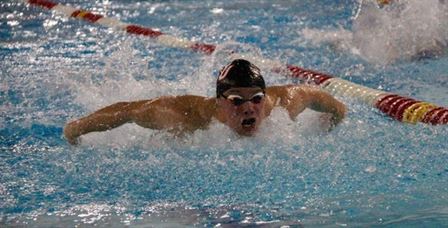
Freshman swimmer Samuel Golovin was pleased with the new branding initiative, believing that it could lead to only positive things ahead.

Samuel Golovin was one of the many athletes that had a positive reaction to the new logos.
Photo courtesy of Montclair State Athletics
“It represents a new start to better years for [Montclair State] athletics,” Golovin said. “[The new logos] would look amazing on our gear as well and our athletes would wear them with pride.”
It is clear that the primary Red Hawk logo with the new font is the most popular among the community. When the athletic page ran an Instagram poll a few weeks ago, an overwhelming amount of people voted for the primary logo with the new font, beating out the Red Hawk head and the Red Hawk logo.
Junior Stephanie Eastman, a thrower on the women’s track and field team, was happy with the changes to all the logos in general.
“The new logos ideas are a bit brighter in color than the previous logo, and it’s something that catches the eye more,” Eastman said.
Eastman believes that these logos go beyond just a fresh look.
“Change is a good thing, and I think it will help to grow the appeal of Montclair State because even the simplest change can give everything a fresh look,” Eastman said.
Collegiate athletics moving forward may be differently formatted when it comes to post-COVID-19 life, so it’s only fitting to have a new logo to accompany that.


